Baukasten: a UI toolkit for building modern domain-specific applications
 Soulaymen Chouri
 Emil Krebs
Do more with less: a deliberately constrained UI library, and why that constraint matters for both humans and coding agents.
Baukasten lets a team, and the agents working alongside it, build rich and dense applications once and run them natively across VS Code, Eclipse Theia, the web, and Electron. The visual layer is handled, the host environment is respected, and the reasoning, human or machine, is reserved for what the application actually does.
Two shifts have reshaped how teams build user interfaces inside IDEs. Microsoft deprecated the Webview UI Toolkit for VS Code on January 1, 2025, and archived the repository days later, leaving extension authors without a maintained, theme-aware component set. This was the go-to solution for building web applications and extensions that run within VS Code while maintaining a consistent VS Code look and feel.
At the same time, a growing share of application code is now produced with coding agents rather than typed by hand. Baukasten is our answer to both — and, as it turns out, the two concerns reinforce one another.
What is Baukasten?
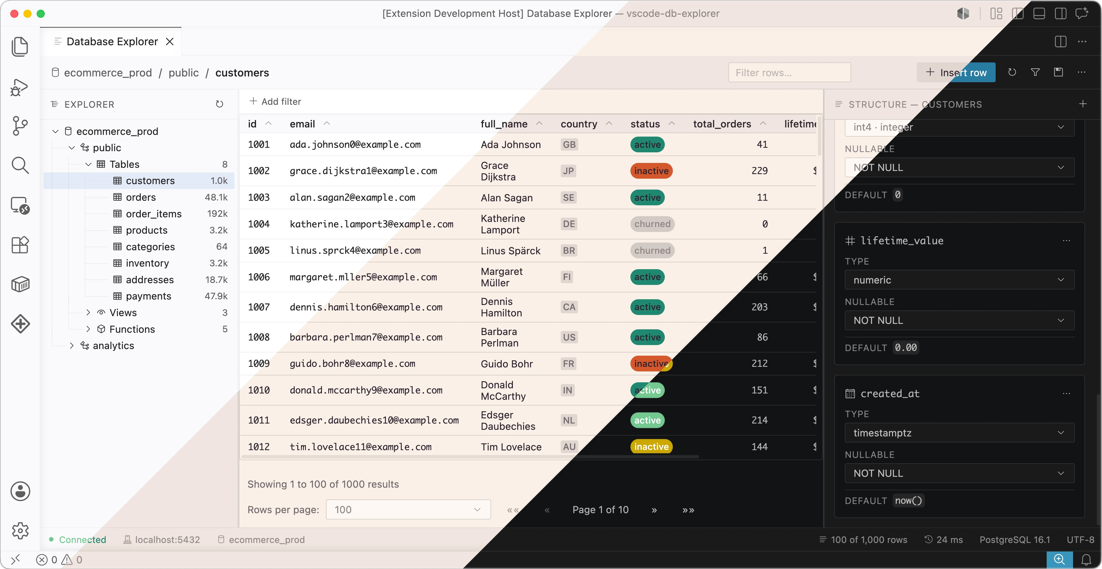
Baukasten (German for construction kit) is a React component library for building domain-specific, IDE-grade applications. By default, applications using Baukasten can be integrated into VSCode flawlessly, looking like being part of VSCode itself.
It spans more than three dozen component families across two entry points: a core set of primitives — buttons, inputs, selects, typography, badges, alerts, modals — and an extra set of higher-level compositions, with additional focus on rich UI as well as performance, including a virtualized data table, a hierarchical tree, tabs, menus, context menus, and split panes. The emphasis is squarely on the dense, data-intensive interfaces that tools and domain-specific applications require.
Why portability matters
Domain-specific tools rarely live in just one place. The same product is frequently delivered as a VS Code extension for developers already in that editor, as a branded desktop IDE built on Eclipse Theia, as an Electron application for installed and offline-capable use, and as a browser-hosted version for instant, zero-install access that runs in any tab, is shareable by link, and stays current for everyone. Historically, each of those targets meant a separate front-end — or at least a separate styling layer maintained by hand. That is duplicated effort and a standing source of divergence: every fix and every new screen has to be reproduced across variants that inevitably drift apart.
Baukasten treats the target as a deployment choice rather than a rewrite. The same component code and the same application logic build for all four environments; only one stylesheet import changes. For a team that begins with a VS Code extension and later wants a standalone desktop product or a cloud version — a path many of our clients are on — the user interface is no longer the part that has to be rebuilt.
One model, four targets
Baukasten is designed to be build-once, deploy everywhere. A single line of code will take care of all the styling needed for a given target:
import 'baukasten-ui/dist/baukasten-base.css'; // always required

import 'baukasten-ui/dist/baukasten-vscode.css'; // VS Code theme variables

// or baukasten-theia.css  — Eclipse Theia variables
// or baukasten-web.css     — self-contained defaults
- VS Code webview — extensions embedded directly in the editor, with tokens resolving to the user’s active VS Code theme.
- Eclipse Theia — custom IDEs and developer tools built on the Theia platform, running in the browser or on the desktop, with tokens resolving to Theia’s theme variables.
- Electron — packaged desktop applications for installed, offline-capable distribution, whether a Theia-based IDE shipped as a desktop binary or a standalone Electron app.
- Web — browser-hosted deployments such as cloud IDEs and internal tools, where no editor host is present and Baukasten supplies its own self-contained default theme.
The application code does not change between them. A <Button> written once renders natively in every one.
Inheriting the host’s theme — and overriding it
The portability above rests on a single decision: components consume only semantic --bk-* design tokens, and each token is defined as the host’s own CSS variable with a built-in fallback. For example:
--bk-color-primary: var(--vscode-button-background, #0e639c);
Inside VS Code this resolves to the user’s actual button color; with no host present, to the fallback. Reusing the host’s tokens is what makes an embedded panel feel like part of the IDE rather than a foreign web page pasted into it. A Baukasten interface inherits the user’s chosen environment automatically — their color theme, light or dark mode, high-contrast settings, and editor font. Someone running a high-contrast or Solarized theme sees your webview in that theme, with no work on your part — and a runtime theme switch is reflected immediately.
This is a real accessibility win: you inherit well-maintained host themes instead of building your own. You inherit the host’s entire catalog of themes and accessibility preferences, and you stay correct when the user changes them.
Customization is the same mechanism in reverse. Because every component reads only --bk-* custom properties, redefining those properties re-themes everything at once — globally or within a scoped container — with no component changes and no recompilation:
:root {
    --bk-color-primary: #6d28d9;
    --bk-color-primary-hover: #7c3aed;
    --bk-radius-sm: 6px;
}
Baukasten’s own rules are published in a dedicated CSS cascade layer (@layer baukasten), so application overrides take precedence without specificity battles. A team can therefore sit on the host theme by default, depart from it deliberately where a brand requires, and do both through the same small set of variables.
A semantic API by design
Baukasten components expose a small, semantic surface for the styling decisions a caller is expected to make. A button takes a variant, a size, and a few layout flags. There is no color, padding, or fontSize prop:
<Button variant="primary" size="md">Save changes</Button>
These named variants are the designed path: they cover the common cases, they stay consistent across every component and every target, and they are the obvious thing to reach for. The standard React escape hatches className and style do remain available for the rare situations that warrant them, but they are not the path of least resistance.
That distinction matters. A component whose easiest way to use it is also an open-ended styling surface is one that a team will, over time, style inconsistently — and a webview that drifts from its host’s design language looks broken to its users. Routing the obvious calls through a small set of variants keeps applications coherent without ongoing effort, while the token layer above remains available for deliberate, system-wide customization.
Agent-assisted development is where the constraint pays off
A coding agent works within a finite budget — a context window and a fixed amount of reasoning it can bring to a task. That budget is effectively zero-sum: attention and tokens spent deciding how something should look are attention and tokens not spent on whether it works. The more incidental decisions a task forces, the less of the agent’s thinking space is left for the part that actually matters.
Conventional UI work is full of incidental decisions. Building a single screen with a general-purpose styling approach — utility CSS, for instance — means choosing colors, spacing, typography, border radii, hover and focus states, dark-mode variants, and breakpoints at nearly every element. None of that is the feature. It is surface area the agent must reason across token by token, and it is surface area where output drifts between files and inconsistencies slip past review.
What Baukasten does for AI
Baukasten is designed to take that surface area away. Because every visual decision is already encoded in the design system and exposed as a small set of named variants, there is almost nothing left for the agent to decide about appearance. Its thinking space is freed to concentrate on what is genuinely hard and genuinely important: the domain logic, the data flow, the state transitions, the edge cases — the behavior that defines the application. Styling is a settled question, so the reasoning goes to correctness.
The effect compounds in practice. A narrower decision space means fewer tokens spent per screen, more predictable and more reviewable diffs, and far less room for an agent to wander — to invent a one-off color, reach for a host-specific hack, or let one panel drift from the look of the next. The agent stays on the rails because the rails are narrow by design.
That only holds if the agent knows the small API precisely. To that end, Baukasten ships an agent skill, write-baukasten, built to the Agent Skills standard:
npx skills add typefox/baukasten
Once installed, the skill loads automatically whenever an assistant encounters an import from baukasten-ui. It is organized for efficient consumption — and to respect the same budget it helps preserve: a slim index is read eagerly, while detailed references (full prop tables for the core and extra components, the data table, and the complete design-token catalog) load only when a given component is in play. Alongside them are tested, multi-component recipes for the patterns these applications repeatedly need: form layouts, confirmation dialogs, toolbars, sidebar navigation, and complete VS Code-style file explorers, settings panels, and command palettes.
The content is audited against the library’s own source. The result is what teams most want from AI-generated UI code and rarely get: accurate imports, real props and defaults, no invented APIs, no host-specific workarounds, and code that compiles and renders correctly on the first attempt. Because the skill follows an open standard, it works with any compatible assistant — Claude Code, Cursor, GitHub Copilot, Gemini CLI, and OpenAI Codex among them.
A practical path for migrations
For teams porting an existing Webview UI Toolkit codebase, this combination is especially relevant. Much of a migration is mechanical: replacing one component vocabulary with another while preserving behavior. Consider a small form moving off the deprecated toolkit:
// Before — Microsoft Webview UI Toolkit
import { VSCodeButton, VSCodeTextField } from '@vscode/webview-ui-toolkit/react';

<VSCodeTextField value={name} onInput={onName}>Project name</VSCodeTextField>
<VSCodeButton appearance="primary" onClick={save}>Create</VSCodeButton>
// After — Baukasten
import { Button, Input, FieldLabel } from 'baukasten-ui/core';

<FieldLabel>Project name</FieldLabel>
<Input value={name} onChange={onName} />
<Button variant="primary" onClick={save}>Create</Button>
This is exactly the kind of repetitive, well-bounded transformation agents handle reliably — provided they have an authoritative reference to work from. With the write-baukasten skill installed, an agent can move through a legacy interface component by component, producing Baukasten equivalents that compile and match the host theme. The constrained surface keeps each step unambiguous, which keeps the migration reviewable. The result is a port a team can supervise at the level of intent, approving each transformation as the agent produces it.
Performance
Performance is easy to overlook until the UI grows large and tightly coupled, at which point it’s hard to retrofit. Baukasten is built with it in mind, at three layers:
- Styling layer — Baukasten uses vanilla-extract, which compiles styles at build time for zero runtime overhead.
- Component layer — data-display components are virtualized via TanStack Virtual, so large tables and lists stay responsive regardless of row count. New data components follow the same rule.
- Compatibility layer — Baukasten is fully compatible with Preact for a smaller runtime footprint.
Getting started
Install Baukasten easily with npm:
npm install baukasten-ui react react-dom
All resources are completely open source and available on GitHub, including the component library, the agent skill, and the documentation:
- Documentation and components: https://typefox.dev/baukasten
- Storybook: https://typefox.dev/baukasten/storybook/
- Agent skill:
npx skills add typefox/baukasten - Source: https://github.com/TypeFox/baukasten
So what are you waiting for? Install Baukasten, start up your favorite agent, and scaffold your next project in minutes, not days!
About the Authors
Soulaymen Chouri
Soulaymen enjoys writing all kind of software. He likes implementing complex algorithms and coming up with new ideas and solutions. Outside of work, he does more work, maintaining a Piano learning application and building small open source projects.
Emil Krebs
Emil is a passionate software engineer who enjoys the whole process of building modern solutions. He loves learning new technologies, contributing to the open source community, and turning ideas into products that people enjoy using.